Predictions
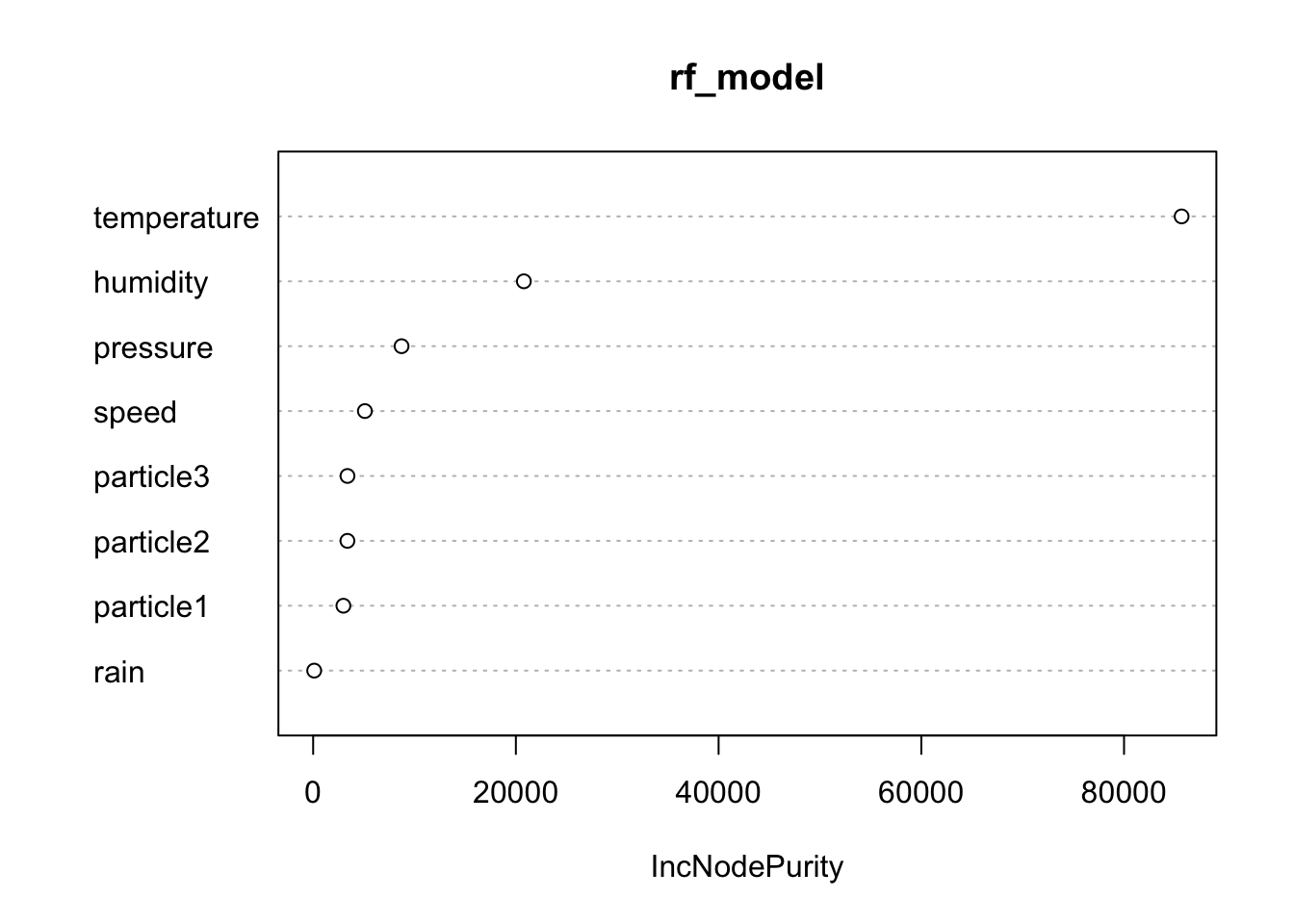
This plot displays the importance of each predictor variable in the random forest model. It helps identify which features (such as humidity, speed, etc.) have the most significant influence on predicting temperature.
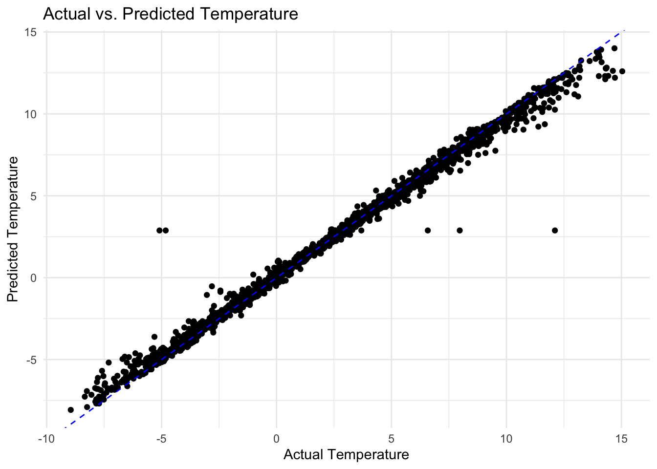
This scatter plot compares the actual temperature values with the predicted values from the random forest model. The dashed line represents perfect prediction, where actual equals predicted temperature.
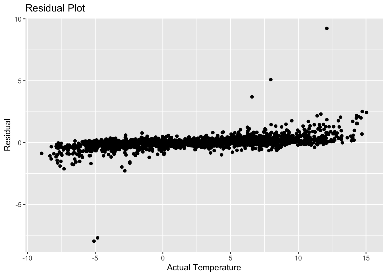
This plot shows the residuals (difference between actual and predicted temperatures) against the actual temperatures. It helps assess the model’s performance and detect any patterns in prediction errors.
         1          2          3          4          5          6          7
5.1931920 7.4186013 -1.1679650 1.5852267 4.0243487 0.8138775 4.3750244 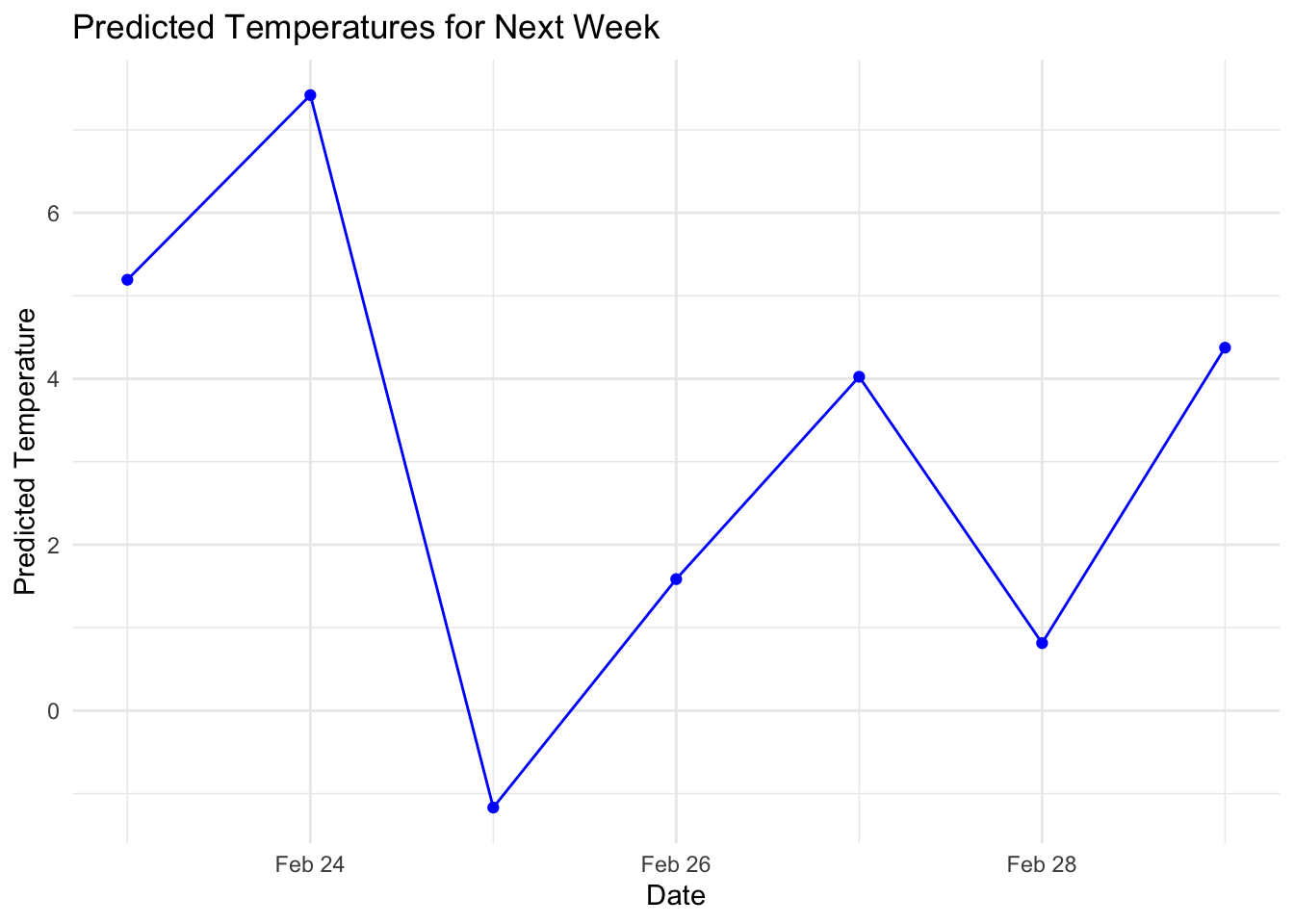
This line plot predicts temperatures for the next week based on the trained random forest model. It helps users anticipate temperature trends for planning purposes.
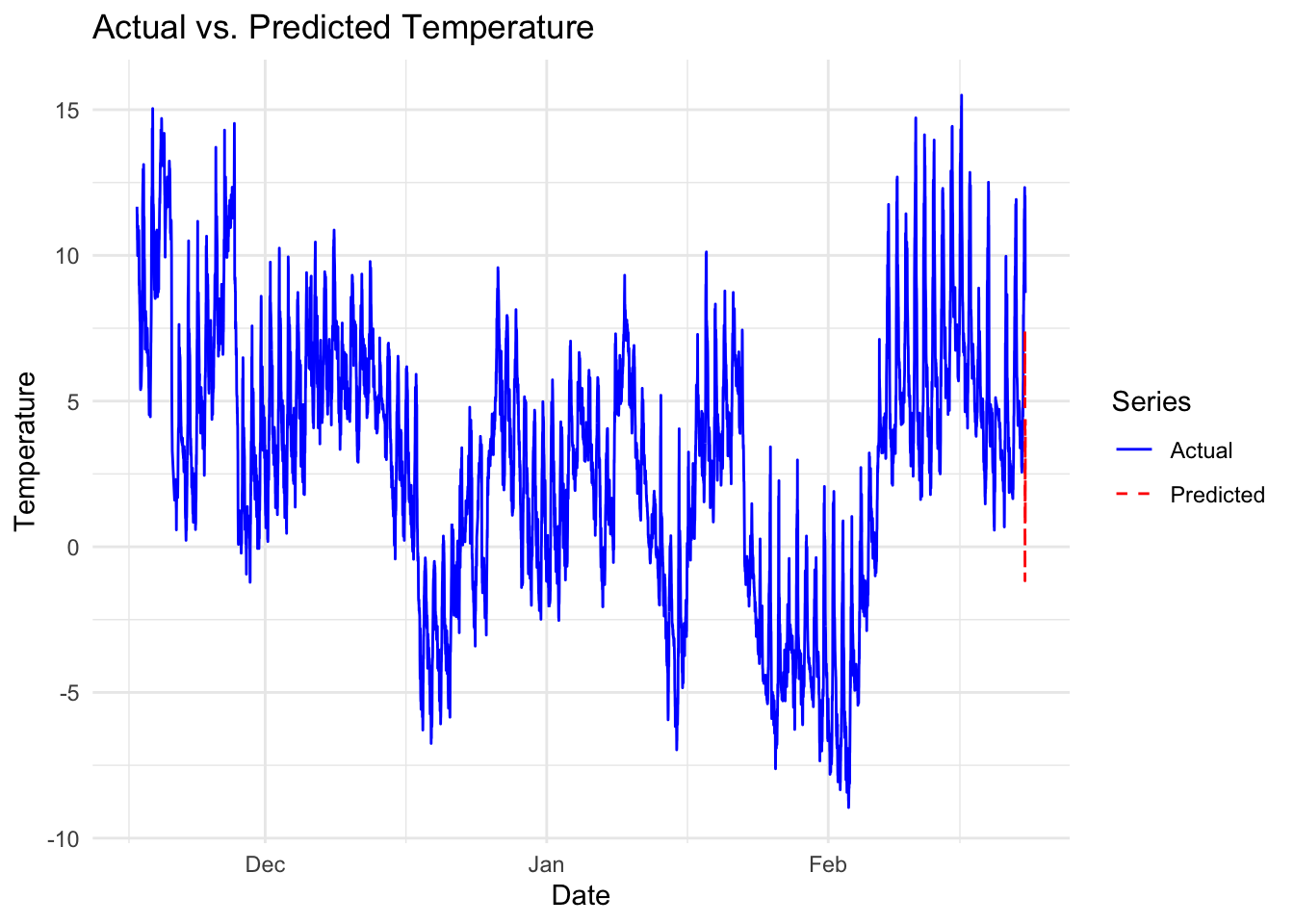
This plot compares hourly actual temperatures with predicted temperatures, including predictions for the next week. It provides a detailed view of model performance over time.